News + Updates
Find out what our team has been up to.
Find out what our team has been up to.
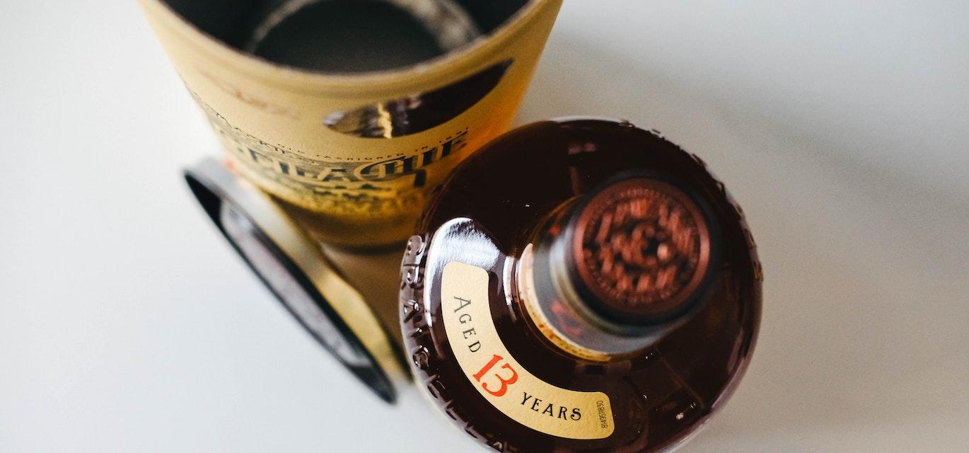
Vintage-inspired packaging has been a strong trend for many years, but it has risen in popularity significantly since 2020. With consumers experiencing uncertain times, the nostalgia from vintage packaging is more welcome than ever. When comfort and assurance are so needed, vintage packaging portrays a level of authenticity and familiarity that reassures consumers.
So, how can you achieve vintage or nostalgic packaging?
Colours
Retro colour schemes are a great foundation for vintage packaging. These colours are more dull or pale, even with typically bright colours like red or blue, which gives an aged, nostalgic feel to the overall design.
Finishes
Using certain finishes, such as a matte finish or a soft touch, can contribute to the nostalgic feel of vintage packaging. However, there are also a range of finishes that can elevate your vintage packaging, such as embossing or debossing, metallic inks (typically silver or gold), or foil stamping.
Font
A few fonts are known as vintage fonts as they’ve been used for decades, including Empress and High Ball. Manuscript lettering and old-time typefaces are also popular choices and obvious ways to signify vintage packaging.
Imagery
Recent packaging design trends focus more on patterns, illustrations, colours, and finishes, whereas vintage or nostalgic packaging may be more text-focused with illustrations as support. Initially, illustrations were included in packaging designs to make the product’s purpose easier to understand. This is still a recurring theme in vintage packaging, where the copy and imagery are balanced, or the copy is more of a focus.
If you're interested in finding out more about vintage packaging, you can reach out to one of our experts here or request a quote online today.
Businesses across diverse industries choose Associated Labels & Packaging to expand their product lines.