
News + Updates
Find out what our team has been up to.
Find out what our team has been up to.
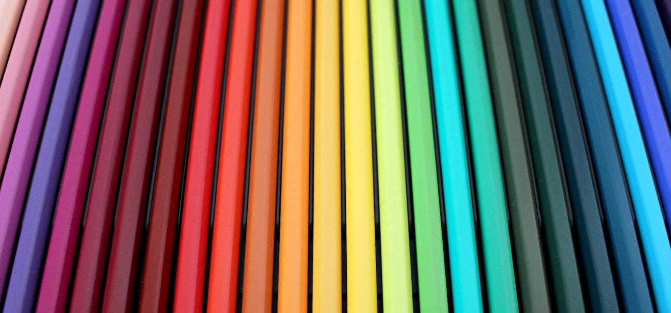
Designing your packaging can take a while. Every detail in your design is crucial to making the biggest impact on potential and current customers, and colour plays a huge role in your packaging’s tone. Here are a few important factors to consider when selecting colours for your packaging:
Don't Forget Your Branding
Sometimes it’s easy to get caught up in trends and forget about cohesion amongst your products. This doesn’t mean that you shouldn’t ever venture beyond your brand palette colours but be sure that any additional colours you choose don’t take away from your branding.
Fit In Or Stand Out
Understanding colour trends in your product category is imperative. For example, in the food and beverage industry, different colours dominate different product categories. A sample of data from Walmart showed common colours based on product types, such as red dominating coffee products and potato chips, and light grey and blue being prevalent in cookies and ice creams. This begs the question; do you want your brand to follow this trend, or do you want to stand out?
Psychology of Colour
Do you know what your chosen colours represent? Think about what message you’re sending across with the colours on your packaging. For example, green packaging can imply that a product is healthy or organic, a specific shade of blue can infer serenity or calmness, purple depicts luxury, and so on. Hence, it’s essential to make sure that the selected colour aligns with your product.
These are just a few tips to consider when choosing colours for your product packaging. At Associated, we have an in-house prepress department full of experts to help you take your packaging to the next level. If you’re interested in finding out more, reach out to us here or request a quote online!
Businesses across diverse industries choose Associated Labels & Packaging to expand their product lines.